⎯ Post Up

Finding beautiful spaces to inspire beautiful work
A conceptualized mobile application for digital nomads to find free workplaces near them.
Role: UI/UX Designer, Researcher
Timeline: 5 Days
Tools: Figma
Problem Statement
Freelancers, remote workers, and other digital nomads are spending more time researching free work spaces to work in than doing their actual work in these places. Most competitor applications focus on presenting food at some workplaces rather than focusing on the work-space itself.
Background
PostUp is a (fictional) start-up where freelancers and remote works share tips and advice. From their users’ feedback, they learned that users are wanting to find good public places to work from. This idea inspired PostUp in wanting to create a mobile application that strives to “make it easier for freelancers and remote workers to find great coffee shops and public spaces to do work from.”
What initially drew me towards wanting to work for PostUp was the fact that they’re a start up that strives to help its users find great coffee shops to work in; and I love coffee shops. I love researching and trying out new coffee shops to not only visit but to also work in. With this, I completely understand the frustrations of users spending more time searching for the different work spaces versus actually working in those places.
This design sprint was completed by following the model of Google Ventures Design Sprint, which is an modified 5-day Design Sprint model.
Day 1: Understand the Map
PostUp received feedback and different discussions from their users in regards to wanting to find good public places to work in. Users wanted:
A quiet place to work.
A place where they can take phone calls without disturbing those around them.
A place where they can have quick meetings.
Interviews
To further their understanding of the problem, PostUp interviewed 9 individuals and asked about their experience finding a public place to work.
“Wifi is definitely the most important thing for me... if I don’t have to buy something to get a password, that’s even better.””

“I definitely look for places that aren’t too crowded, especially if I’m trying to get a lot of work done in a short amount of time.”

“I know a lot of places to go near me, but I’m often in other parts of the city and need a place nearby to post up for an hour or two between meetings.”

Interview Insight: Time is important and valuable!
The users interviewed highlighted that time was valuable for them. Users want to spend less time finding a place where they can work and instead spend more time at the actual workplace. This backs up my hypothesis that creating an application that can help users reduce their time researching workplaces would be a valuable tool.
Name: Nina
Age: 32 Years Old
Occupation: Freelance Copywriter
Location: Boston, MA
Persona by PostUp

Behavior:
She works from home when she can but spends at least 3 days a week traveling around the city for client meetings and remote work.
She often has a few hours in between meetings and tries to find places where she can sit down and get some work done, or take a phone call.
She isn’t always familiar with the part of the city that she’s in, so she spends a lot of time looking for a good place to “post up” and do some work.
Frustrations:
She often spends more time looking for a place to work than actually working!
She sees this as a big waste of time and this causes her stress because she needs to get work done.
She will find a place to work and settle in, only to realize there’s not reliable wifi signal, no restrooms, or that she needs to spend money to stay there. She either has to go with it or spend more time packing up and finding a new place.
Goals:
She wants to spend less time finding a public places to work from and spend more time getting her work done!
She wants to find places that have the basic amenities she needs to do her work, before she settles in to start working.
She wants to find somewhere to work that isn’t too crowded or noisy, in case she needs to meet someone, or take a phone call.
Now with this information, how might we…
Create an application to reduce users’ time to research different free workspaces and allow them to spend more time working in these places.
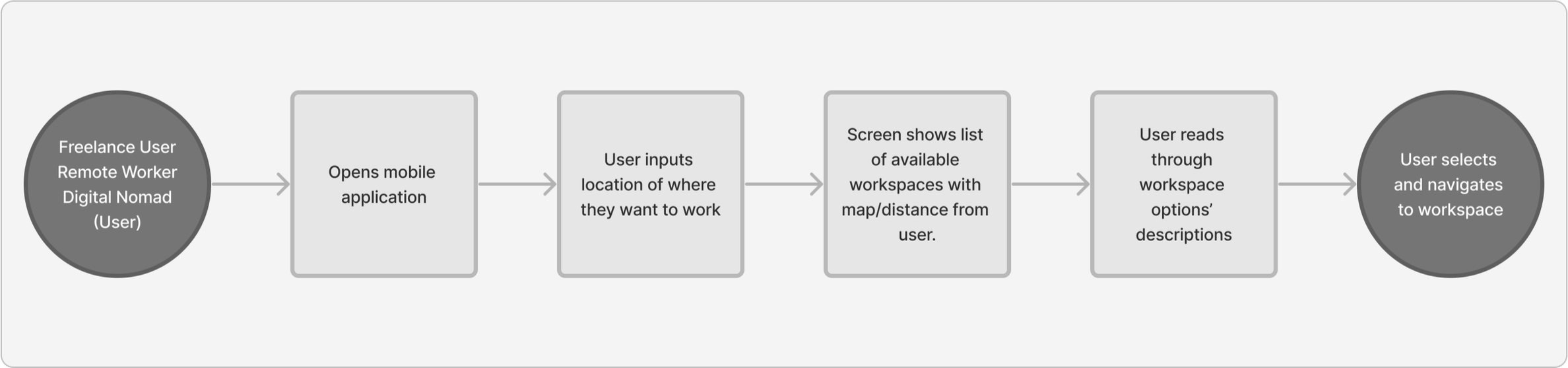
End-to-end User Experience
Utilizing the information provided by user interviews, I went ahead and created an end-to-end user experience chart (via FigmaJam). I wanted to create an experience that was:
Convenient
I focused on building a prototype for a mobile application since most users will be on-the-go and on their phones.

Design Constraints
I also need to keep the following design constraints provided to me in mind before I started to create the prototype:

Must be a mobile application.

Must charge monthly fee to its users.
Must find places that already exist.
Fast
Time is of the essence! I wanted users to be able to quickly find the results that they need to get to their next destination to work.

Easy to use
Finding a place to work in a short period of time is already hard... so I wanted to build an application design that was easy to use and follow and intuitive.

Day 2: Sketching the Solution
PostUp received a lot of feedback and different discussions from their users in regards to wanting to find good public places to work in. Users wanted somewhere:
A quiet place to work.
A place where they can take phone calls without disturbing those around them.
A place where they can have quick meetings.
Lightning Demo Research
Naturally, when I think of about finding a new space to work from, I turn to Google or Yelp. However, to my surprise, I was able to find a handful of applications to find nearby work places.
Many of the applications that I found (such as CommonGrounds Workplace and CapitalOne) offered free searches. But because a design constraint included charging a monthly membership by PostUp, I tried searching for membership-based applications. This had me find the following:

Croissant Coworking


Croissant Coworking is a mobile application that charges a monthly membership to give its users access to shared workspaces all over the world.
“Coworking spaces have the beautiful and comfortable cafe-vibe without the barrier cafes often come with: fighting for a seat, findind a power outlet, connecting to unreliable WiFi, and buying too many cups of coffee and croissants to easy your guilt about staying for hours.”
I appreciated what they stood for, and based on the quote that I had found through their website, it check-marks all of the things that I would personally look for if I were to use an application like this.

WeWork


WeWork is also a mobile application that charges a their rooms and work spaces daily. Depending on what room or desk space you are searching for, the prices vary.
“Find productive workspace for our needs, whether it’s a single desk, a meeting room, or a private office.”
I liked how on their website, it states that they are trusted by the world’s top companies, however, it wasn’t translated to the application itself. And strangely, I found that the desktop version of the product provided more information on the workspace than the mobile application. In order for myself to receive more information on a particular workspace, I would need to click into the room or desk to read the descriptions.
In addition to searching for inspiration from other workplace finding applications, I also turned to Sephora for their reviews section.

Sephora’s reviews (specifically for their foundation reviews) lists their users’ skin conditions and other problematic skin areas that they want addressed and fixed by make-up products. I find these kinds of reviews helpful because I usually try to find someone who has my skin type or similar problem areas.
I wanted to create a review section, inspired by this, so users can search up reviews based on what they want to find at their desired workspace. Whether it’s strong WiFi connectivity or a good cup of coffee, you can easily determine this based on the reviews left.
Crazy 8’s
After resesarching the problems, I sketched out the user’s experience from searching for their desired shop and through the “check out process.”

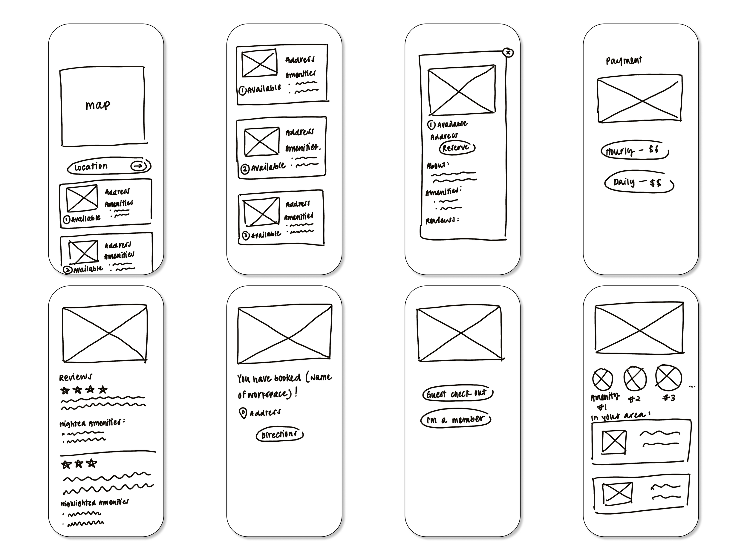
Solution Sketch
Next, I focused on writing up a solution sketch for the listed office locations (which was sketch #2 from the above sketch).
Screen 1
The user can write down the location of where they would want to reserve a working space
Filters would include
Miles away from the user
Working space Type
Capacity of the space
Amenities
Large search button to make CTA clear
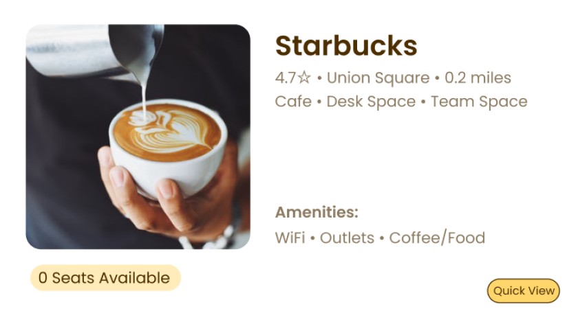
Screen 2
The second screen would list the different workspaces available for the user based on their search
Listing out the names of the workspaces
Preview image of the workspace
Short list of amenities
How many seats are available
Screen 3
The third screen would be of the quick preview of the workspace which would list:
Address
Longer list of amenities
Top highlighted review
Day 3: Create a Storyboard
At this point of the design sprint, usually ideas would be discussed among team members and select ideas that the team desires to work on. However, since this modified design sprint is a solo project by myself, I made the ultimately and final decision on what solution to pursue and design.
For my particular solution, I wanted to focus on the screen that lists different options to the user. Some questions that I had asked myself during this design process were:
How can we make it so that users are more tempted to utilize our application to find their workspaces over Google and Yelp?
How can we make it convenient to make everything an all-in-one platform and a place where users can receive all of their information in one place?
I want to strive to create an appealing user experience so (like Yelp and Google) it can become a second nature instinct for users to utilize this resource over the others.

As I sketched this storyboard, I was imagining myself booking an Airbnb or booking a reservation at a restaurant on Yelp. I wanted to make sure I incorporated:
Provide their location - This can allow users to quickly browse the workplace results nearby them.
Quick View - I wanted to provide the option of users to read a quick summary of the cafe without having to completely enter a new screen.
The full view of the screen would have more detailed information.
Seat reservation - Users can reserve seats as a member or a guest.
Members would be charged a monthly fee while guests have to pay a daily rate.
Navigation - I wanted to incorporate an internal navigation system so users do not exit the application but can still easily navigate to their destination.
Day 4: Prototype


After researching, sketching, and creating my storyboard... I finally started creating my prototype. I was able to create my prototype within a day!
I was heavily inspired by Yelp because that is the application that I would naturally gravitate towards in order to find a new working space or coffee shop.
As I enter into the testing phase, I hope to learn how my users will be interacting with the design and to also see their reactions as to how familiar it feels (since it is inspired by Yelp). I found it difficult to not completely copy Yelp’s design since it was so heavily inspired. However, I approached the design portion as a way for myself to make small tweaks to Yelp that I would find useful as a user myself.
Day 5: Validating the Design
I recruited five participants to test my design and to receive feedback. Due to COVID-19, the testing was done all via Zoom. The participant’s interaction with my design was observed by the participant sharing their screen with me.
The majority of the participants were students, and a question that I had asked all participants as a warm up question was “Do you like to work in coffee shops or in a space outside of your home?” 100% of the participants said yes. And a common frustration that my participants had when searching for another workspace would be spending too much time searching for a spot.
“I would sometimes spend 30 minutes to an hour just trying to find a spot... ”
I received a positive response from my design. Many stating that the design was straight-forward and very reminicent to Yelp (as I had predicted). I mostly had to make UI changes to my design.
The first change I had made was because I noticed a lot of users skipping over the “Quick View” button. Instead, the users went straight to the full view page of the workplaces in my first design interation. One of the participants said she didn’t notice the “Quick View” button at first, and had suggested to increase the button size because she thought it was a cool concept to see a brief summary fo the coffee shop.
Iteration #1

Iteration #2
Another UI improvement I had made was changing the wording to my reservation button. Users who tested it said the wording was confusing because it seemed that only Members (and not nonmembers) can reserve a seat). So I removed the wording altogether.

Iteration #1

Iteration #2
Lastly, I made improvements to the reviews. There were a couple of suggestions provided for this part of the design. The first was to move the “Photos from other Posters” above the ratings. Users found that it was distracting and almost broke up the fluidity of the reviews. The second improvement was to provide more reviews than just the “Top Poster,” because seeing at least three visible reviews can provide a general overview of the place.


Iteration #1
Iteration #2
What I learned
At first, entering a design sprint was quite daunting. The idea to complete an entire design in a week’s time (for the first time) seemed scary to me! However, I had so much fun creating and researching for this project! I definitely learned a lot in regards to how to work efficiently and also practiced my usability testing skills.
I wish this could have been a full-blown project because I became more excited to learn how to better improve the design with more testings!