⎯ Up to Scaler

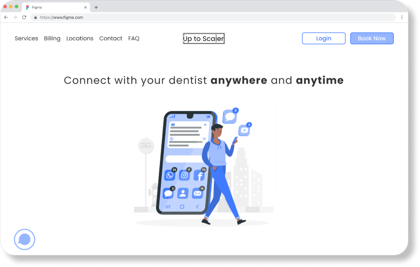
Connect with your dentist anywhere at anytime.
Developed a conceptual web application prototype for patients to utilize for scheduling dental appointments and obtaining other dental information.
Duration: 4 Months
Role: UI/UX Designer, Researcher
Tools: Figma, Miro, Marvel
Problem
Patient retention has decreased despite there being more dental practices.
As someone who has worked at the front desk of a dental office, I have seen and heard patients’ excuses for not wanting to schedule their next dental appointment. It became worse after the COVID-19 pandemic.
This led me to question, how might we improve the experience of patients to make them want to schedule and come to their dental appointments?
Solution
1
Create a space to prepare and educate patients.
Access information before committing to an appointment or mentally prepare themselves.

2
Allow patients to schedule themselves online.
Provides the flexibility to schedule appointments online on their own time.

3
Text message, E-Mail, and having everything online!
Have access to ask questions or contact their providers at anytime online.
Research
Dental offices are having diffculty retaining their patient numbers.
Initially, my project was inspired by my experience working as an administrator in the dental office. After Shelter-in-Place was ordered in the Bay Area, the number of cancellations increased and new appointment scheduling decreased drastically. This problem was not only experienced in our clinic, but dental clinics across the United States.
Increased Appointment Cancellations
Decreased Appointments Scheduled
The primary problem is that dental offices were struggling to schedule new and existsing patients due to the fears created as a result of the COVID-19 pandemic. According to the American Dental Association, “while 99% of dentists have reopened, the number of patients visiting offices remains about 20% below usual levels.”
COVID-19 was not the only reason why users did not go to the dental office.
I had initially wanted to learn about how the pandemic affected my interviewees’ thoughts and experiences of going to the dental office after the pandemic.
Some questions that I wanted to answer were:
How can we increase patient’s trust in understanding that going to their dental offices is safe during a pandemic?
Why are some patients okay with going to their dental offices while others are fearful and avoiding their visits?
User Interviews


Six 30- minute User Interviews
19 Survey Responses
The interviews were further broken down into an affinity map which allowed myself to organized the information into different insights.

Research Insights and Shift in Study
Fear was the primary theme even prior to the pandemic!
Fear seems to be the major theme among the interview candidates
COVID prompted fear for going to places, but what is unique is pre-COVID people also feared going to the dentist
Due to this discovery (as well as the release of the COVID-19 vaccine), I wanted to shift my focus from understanding people’s views of going to dental offices after COVID to wanting to understand the overall patient retention of dental offices.
Research after shift in studies
Competitive Analysis
There is a lack of dental offices using scheduling applications!
A common thing that I noticed from my user interviews is that many offices lacked online platforms to help patients schedule and fill out health paperwork.
Many of the interviewees stated that they would appreciate it if their dental offices had a better online presence where they can schedule their appointments online, and fill out paperwork.
To better understand healthcare websites that allowed for both, I studied
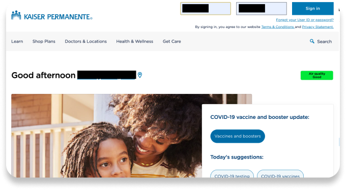
kp.org
My Doctor’s Online - Kaiser’s scheduling platform
Kaiser Permanente did a good job providing both to their patients, but why not combine the two into one?

Design
All-in-one is the way to go
I wanted to create an all-in-one application that will not only provide the users (patients) with the ability to schedule their appointments, but I wanted to also create a space that will educate patients and give them access to all of their dental records and forms in one easy and convenient space!
Throughout my design process, I learned the following:
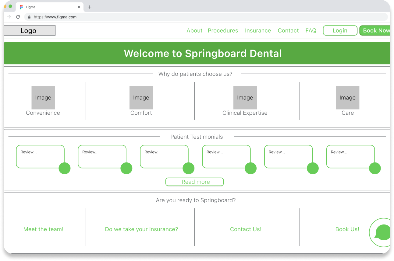
Minimalism led to confusion
Although the users found the design “straight-forward,” the lack of instruction made the minimal design hard to follow on some pages.
With this, I changed my design to include more instruction so users (patients) of all ages are able to have a smoother and easier experience with the website.
Testing and Improvements
Changes to make it user friendly.
I created various iterations of my prototype. Based on feedback from my testers, peers, and mentors, I continually changed my design and created four iterations. With these iterations, there were 3 primary improvements.
1


The simpler, the better!
Color! I initially created the prototype with a green color scheme. Although it was a pleasing color scheme, based on user feedback, it didn’t fit the healthcare professional tone and brand that was created.
The homepage was also spaced out. I initially created a homepage to fit everything (why users should choose us, reviews, and links), but eventually, I created the home page a scrollable home page that initially starts out with the simple phrase “Connect with your dentist anywhere and anytime.” This simplification makes the homepage easier on the eye.
2


Changed to multiple choice and wording
I changed the initial tab format to a multiple-choice setting for the user. The tabs on the top were not as intuitive to the user as I had initially thought they would be.
I simplified the boxes to only show when the provider was available. The other boxes “Out of office” and “Lunch” distracted the user from the point of the screen. I also changed he wording from “Book” to “Available.”

3


Added a map and clearer instructions
I added a map alongside a summary of the appointment type and address of the office that the user can use to confirm what they wanted.
I added additional instructions for the user and additional options for the user (i.e. giving the user the option to fill out forms now or later).
Final Product
Some final screens


What I learned
Some things that I would do differently for my future projects:
Do not try to be perfect!
Throughout the process, I tried to make every screen picture perfect. But by doing this, I spent too much time on every screen for earlier iterations. Although I do not regret the time I spent on my project, I do wish I worked more efficiently.
Assume less, and user test more!
This is much easier said than done. I know the learning material even warned us about this. But my brain continued thinking “I think they would like...” However, during the tests, I was able to learn more. If I could go back in time, I would tell myself to test more rather than brainstorm assumptions.